Why Your 48-Hour Simulation is Useless Without Smart Post-Processing
So, you did it. You wrestled with the geometry, spent hours perfecting the mesh, and patiently watched the residuals drop over two days of solve time. The solver says “Calculation Complete.” Now what? You’re left with a file, maybe several gigabytes in size, full of numbers. On its own, that data is meaningless.
This is where the magic happens. Post-processing is not just the final step; it’s the step that turns raw data into discovery. It’s how you prove your design works, find its fatal flaw, or unlock an insight that leads to a breakthrough. Without a solid understanding of this stage, even the most complex simulation is just an expensive number-crunching exercise. This guide is your starting point for transforming those numbers into engineering wisdom, a core part of the entire workflow explained in our Ultimate Guide to Computational Fluid Dynamics.
The Core Trio of CFD Visualization: Unpacking Contours, Vectors, and Streamlines
Before you can interpret anything, you need to see it. Most CFD software gives you a powerful toolkit for visualization, but 90% of the time, you’ll be leaning on three heavy hitters:
- Contours: These are your color maps. They show how a scalar quantity (like pressure, temperature, or velocity magnitude) is distributed across a surface or through a volume.
- Vectors: These are arrows. They’re perfect for showing the direction and magnitude of the flow at specific points. Think of them as a field of tiny weather vanes.
- Streamlines: These are lines that trace the path of massless particles through your flow field. They give you an intuitive feel for the overall flow pattern.
The clarity of these visuals is directly tied to your initial setup. A poor mesh will give you jagged, unreliable plots, which is why understanding key CFD meshing concepts is so critical. Similarly, your results will be nonsense if you haven’t correctly defined how the fluid enters and leaves the domain by choosing the right boundary conditions.
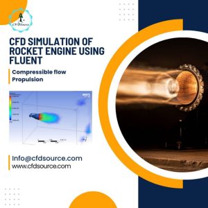
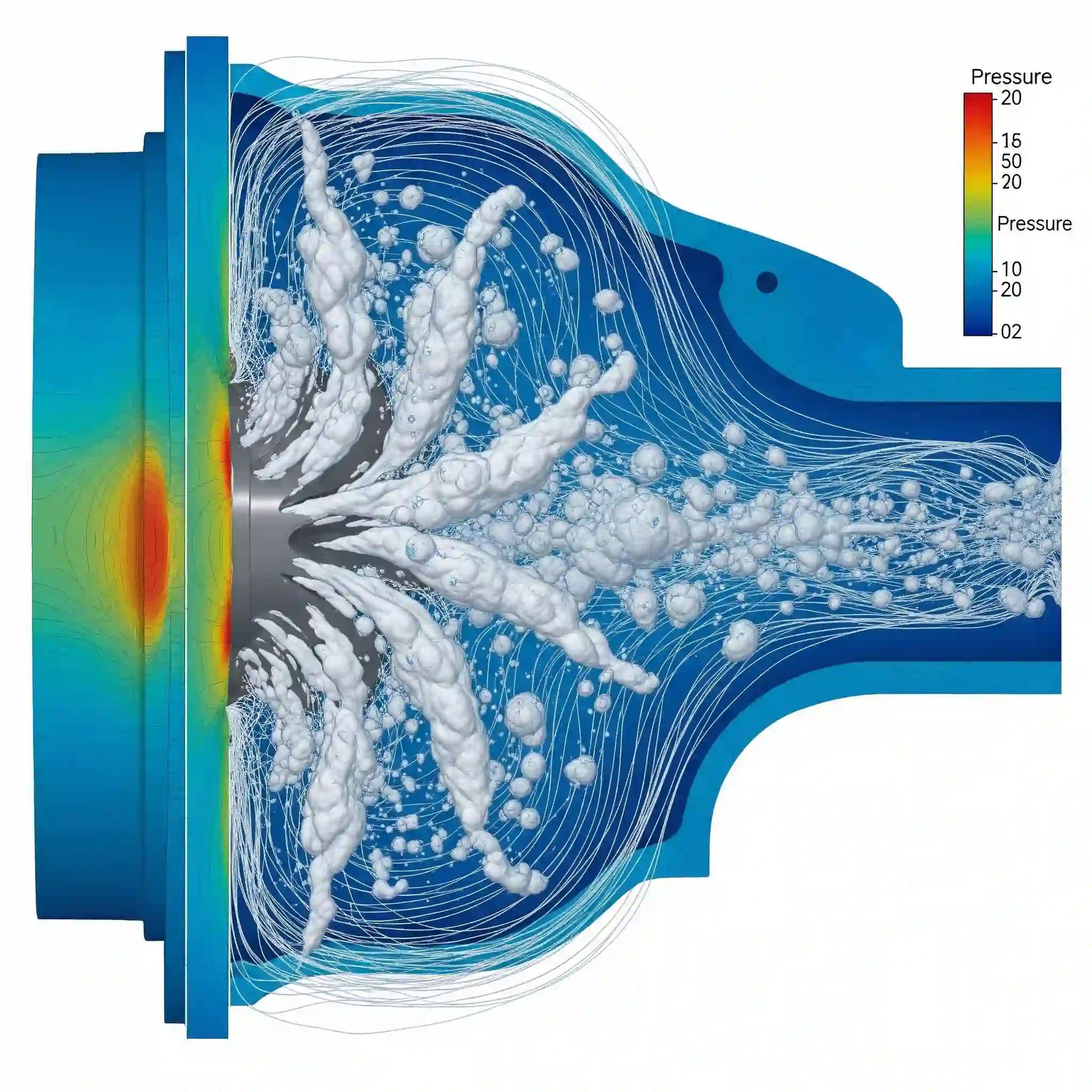
Contour Plots: Mapping Critical Parameters Like Pressure and Temperature
Think of a contour plot like a thermal camera image or a weather map. It uses color to represent value. In CFD, we use it to instantly spot areas of interest. That bright red region on your heat sink? That’s a potential failure point. The deep blue area on the upper surface of an airfoil? That’s the low-pressure zone generating lift.
They are incredibly powerful for getting a quick, big-picture view. Are there hotspots? Are pressure gradients where you expect them to be? It’s your first-pass diagnostic tool.
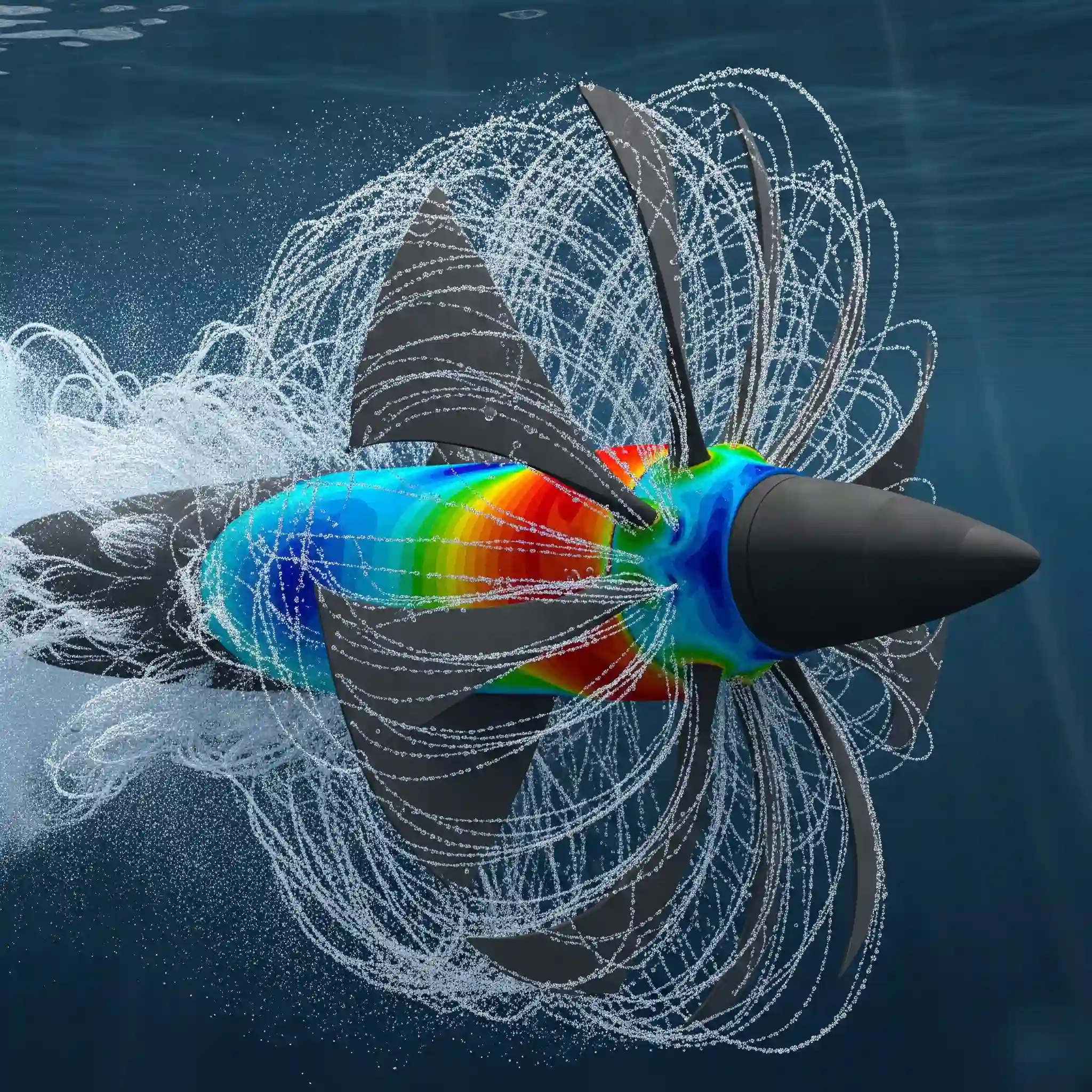
Vector Plots: Visualizing Flow Direction, Velocity, and Turbulent Structures
While contours show how much, vectors show which way. A vector plot is an array of arrows where the length of the arrow shows the speed and its orientation shows the direction of the flow.
This is how you find the really interesting stuff. Want to see that recirculation zone behind a building that’s causing trouble? Vector plots will show the swirling flow patterns clearly. 🌪️ They are essential for identifying flow separation, vortices, and other complex structures that a simple contour plot might miss. They let you visulize the chaos of turbulence.
From Pretty Pictures to Engineering Insights: How to Actually Interpret Your Results
This is the part that separates a technician from an engineer. After well over a decade in this field, the biggest mistake I see beginners make is stopping at the “pretty picture” phase. A colorful plot doesn’t mean the result is correct or useful. You have to question what you see. Does it make physical sense? Do the results align with theory?
Knowing how to generate a plot is easy. Knowing how to critically analyze it, spot anomalies, and connect it to real-world performance is a skill. This is where you move beyond the software and engage your engineering brain. It’s easy to misinterperet a plot if you’re not looking for the right things, and that’s often where the value of a professional CFD Consulting Service comes in—providing that second, experienced eye.
Reading Pressure Contours: Identifying Stagnation Points, Flow Separation, and Shock Waves
Let’s get practical. You’ve plotted the pressure contour over a car body. What are you looking for?
Look for a high-pressure (usually red) spot right at the front bumper. That’s your stagnation point, where the flow comes to a dead stop. Now, look at the roof as it curves down towards the trunk. Do you see the pressure suddenly change and the flow get messy? That might be flow separation, a major source of drag. Of course, none of this analysis is valid unless you’re confident in your solution, which is all about understanding what convergence in CFD means. If your solution isn’t converged, you’re just looking at colorful noise.
| Feature to Look For | What It Looks Like on a Pressure Contour | Why It Matters for Design |
| Stagnation Point | A localized area of maximum pressure (often red) at the front. | Main point of impact pressure; affects forces and loading. |
| Flow Separation | An abrupt change in pressure gradient, often on curved surfaces. | Creates drag, reduces lift, can cause instability. |
| Low-Pressure Wake | A large region of low pressure (often blue) behind the object. | The primary contributor to pressure drag. |
Analyzing Velocity Profiles: Understanding Boundary Layers and Wakes Like a Pro
Now, switch to velocity. Plot it on a plane cutting through the model perpendicular to a surface. The velocity right at the solid wall should be zero (the no-slip condition). As you move away from the wall, it should smoothly increase until it reaches the free-stream velocity. This region of changing velocity is the boundary layer.
Is it thin and attached, or is it thick and separating from the body? The shape of this velocity profile tells you everything about the friction drag on your object and how “slippery” it is. A thick wake behind your object? That’s a visual indicator of high drag, a pocket of slow, recirculating flow that’s costing you energy. its a huge deal for aerodynamic efficiency.
Beyond Visuals: How to Extract Quantitative Data That Drives Decisions
Visuals give you the “what” and “where,” but numbers give you the “how much.” And “how much” is what engineering decisions are built on. Your boss or professor doesn’t want a pretty picture; they want to know the drag coefficient, the peak temperature, the pressure drop in psi. This is where you move from qualitative observation to quantitative analysis, and it’s the most critical part of the job.
You need to integrate forces over surfaces, calculate mass flow rates through openings, and plot specific values along a line. These are the metrics that go into your design tables and reports.
A CFDSource Guide: Calculating Key Forces (Drag & Lift) and Mass Flow Rates in Ansys Fluent
Most software packages have built-in reporting tools that make this straightforward, but you need to know where to look and what to ask for. For example, in Fluent, you’d typically go to the “Reports” section. Here are the essentials you’ll be calculating constantly:
- Forces Report: This is your go-to for lift, drag, and side forces. You’ll specify the wall zones (like the surface of an airfoil) and the direction vector for each force.
- Surface Integrals: Use this for almost everything else. You can calculate mass flow rate at an outlet, average pressure on a surface, or the total heat transfer rate.
- XY Plots: Essential for digging into details. You can plot velocity profiles away from a wall or pressure along the centerline of a pipe. This is how you validate boundary layer calculations.
The 3 Most Common Post-Processing Mistakes We See at CFDSource (And How to Avoid Them)
I’ve seen brilliant simulations get undermined by simple post-processing errors. It’s painful. Here are the three most common traps:
- Deceptive Color Maps: Using an automatic color range can hide the story. If a tiny, irrelevant hotspot is skewing your entire temperature scale, you might miss subtle but critical variations elsewhere. Always manually adjust your legend range to focus on the area of interest.
- Plotting on the Wrong Plane: You create a beautiful contour plot on a plane that completly misses the vortex shedding or the recirculation zone you’re looking for. Always create multiple section planes and animate the view through your domain to ensure you’re not missing the main event.
- Ignoring the Mesh: If you see jagged, blocky contours, don’t just smooth them over. It’s a scream for help from your mesh. Your results are only as good as the cells they live on. A beautiful plot on a terrible mesh is just a high-tech lie. It all starts with preparing your geometry properly for analysis.
The Critical Step Most Beginners Skip: Validating Your Results for True Accuracy
This is the big one. How do you know your simulation is reflecting reality? You have to validate it. This means comparing your CFD results against something known and trusted—either experimental data, published research, or a known analytical solution.
For example, if you’re simulating airflow over an airfoil, compare your calculated lift coefficient against wind tunnel data for the same Reynolds number. If they don’t match, you need to find out why. Maybe your domain wasn’t big enough, or maybe you need to rethink your approach. The choice of physics, especially understanding different turbulence models, plays a massive role here. A k-epsilon model will give you a very different answer than a k-omega SST model in certain situations.
Your Essential Post-Processing Checklist: 7 Things to Do Before Finalizing Your Report
Before you export that final JPEG, run through this quick sanity check. It’s saved me from embarrassment more than once. ✅
- Confirm your residuals have converged properly.
- Check for physical realism. Is the pressure negative in an absolute sense? Is velocity higher than the inlet?
- Verify mass conservation. Does the mass flow rate in equal the mass flow rate out?
- Ensure your plots are clearly labeled with units.
- Check your boundary layer profile. Does it look physically plausible?
- Compare key values (like drag) with a quick hand calculation or a known benchmark.
- Have a colleague take a quick look. A fresh pair of eyes can spot things you’ve been staring at for hours.
When Your Project Demands More Than Just Standard Plots
Sometimes, you need to tell a more complex story. For highly unsteady flows, you might need to create an animation of vortex shedding. For understanding a thermal plume, an isosurface showing the 100°C temperature boundary might be more insightful than a 2D slice.
For multiphase flows, you might need to track individual particles or plot the volume fraction of a liquid. These advanced techniques require a deeper understanding of both the software and the underlying physics. When the stakes are high on a commercial project, this is often where a dedicated fluid dynamics consultant can help translate complex data into a clear, actionable path forward.
Conclusion: Turning Raw CFD Data into Actionable Design Improvements
Remember, post-processing isn’t just a final step to create visuals for your report. It is an active investigation. It’s where you become a detective, sifting through data to find clues that lead to a better design. You’re not just clicking buttons; you’re asking questions and letting the physics guide you to the answers.
Need an Expert Eye on Your Results? Partner with CFDSource for In-Depth Analysis
For complex industrial challenges, sometimes you need a team that has navigated these waters hundreds of times. If you’re looking for a partner to help you visualize and interpret CFD results for your product development, our team at CFDSource lives and breathes this stuff. We can help you move from data to decisions with confidence.